DataVisualisation

0、概述

本阶段完成了关于数据可视化的学习,这部分的学习为我打开了一扇通往新世界的大门。
一个人如果能再某个领域成为专家就已经是一件很了不起的事情了,对于MachineLearner来说,将会面对不同领域的问题,需要具备不同的DomainKnowledge是一件几乎不可能的事情,可能我们通过几周或者甚至几天的学习,对问题领域有个大概的了解,但是对不同的Feature之间的关系,影响可能就无法知晓了,当然我们可以通过咨询相应领域的专家,不过这实际上也是一件相当不易的事情。
数据可视化就想武器中的瑞士军刀,它将数据以图表的形式展现在MachineLearner的面前,通过观察图表,我们可以知道数据与数据之间的联系,可以连接到数据的走上,范围,概率分布等。通过这些,我们可以方便的挑选适合我们模型的Features。
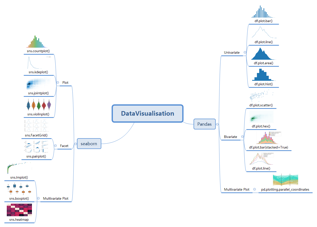
1、思维导图

DataVisualisation

2、使用方法

2.1、Univariate plotting with pandas

1
2
3
4
5
6
7
8
9
10
11
12
13
14
15
16
17
18
19
20
import pandas as pd
reviews = pd.read_csv("../input/wine-reviews/winemag-data_first150k.csv", index_col=0)
reviews.head(3)
# Bar Chat
# Good for nominal and small ordinal categorical data.
reviews['province'].value_counts().head(10).plot.bar()
(reviews['province'].value_counts().head(10) / len(reviews)).plot.bar()
reviews['points'].value_counts().sort_index().plot.bar()

# Line charts
# Good for ordinal categorical and interval data.
reviews['points'].value_counts().sort_index().plot.line()

# Area charts
# Good for ordinal categorical and interval data.
reviews['points'].value_counts().sort_index().plot.area()

# Histogram
# Good for interval data.
reviews[reviews['price'] < 200]['price'].plot.hist()

2.2、Bivariate plotting with pandas

1
2
3
4
5
6
7
8
9
10
11
12
13
14
15
16
17
18
19
20
21
22
23
import pandas as pd
reviews = pd.read_csv("../input/wine-reviews/winemag-data_first150k.csv", index_col=0)
reviews.head()

# Scatter Plot
# Good for interval and some nominal categorical data.
reviews[reviews['price'] < 100].sample(100).plot.scatter(x='price', y='points')

# Hex Plot
# Good for interval and some nominal categorical data.
reviews[reviews['price'] < 100].plot.hexbin(x='price', y='points', gridsize=15)

# Stacked Bar Chart
# Good for nominal and ordinal categorical data.
wine_counts = pd.read_csv("../input/most-common-wine-scores/top-five-wine-score-counts.csv",index_col=0)
wine_counts.head()
wine_counts.plot.bar(stacked=True)

wine_counts.plot.area()

# Bivariate Line Chart
# Good for ordinal categorical and interval data.
wine_counts.plot.line()

2.3、Multivariate plotting with pandas

1
2
3
4
5
6
7
8
9
10
11
12
13
14
15
16
17
18
19
20
21
22
23
24
25
26
27
28
29
30
import pandas as pd
pd.set_option('max_columns', None)
df = pd.read_csv("../input/fifa-18-demo-player-dataset/CompleteDataset.csv", index_col=0)

import re
import numpy as np

footballers = df.copy()
footballers['Unit'] = df['Value'].str[-1]
footballers['Value (M)'] = np.where(footballers['Unit'] == '0', 0,
footballers['Value'].str[1:-1].replace(r'[a-zA-Z]',''))
footballers['Value (M)'] = footballers['Value (M)'].astype(float)
footballers['Value (M)'] = np.where(footballers['Unit'] == 'M',
footballers['Value (M)'],
footballers['Value (M)']/1000)
footballers = footballers.assign(Value=footballers['Value (M)'],
Position=footballers['Preferred Positions'].str.split().str[0])

# Parallel Coordinates
from pandas.plotting import parallel_coordinates

f = (
footballers.iloc[:, 12:17]
.loc[footballers['Position'].isin(['ST', 'GK'])]
.applymap(lambda v: int(v) if str.isdecimal(v) else np.nan)
.dropna()
)
f['Position'] = footballers['Position']
f = f.sample(200)
parallel_coordinates(f, 'Position')

2.4、Plotting with seaborn

1
2
3
4
5
6
7
8
9
10
11
12
13
14
15
16
17
18
19
20
21
22
23
24
25
26
27
28
29
30
31
32
33
34
35
36
import pandas as pd
reviews = pd.read_csv("../input/wine-reviews/winemag-data_first150k.csv", index_col=0)
import seaborn as sns

# Count (Bar) Plot
# Good for nominal and small ordinal categorical data.
sns.countplot(reviews['points'])

# KDE Plot
# Good for interval data.
sns.kdeplot(reviews.query('price < 200').price)
sns.kdeplot(reviews[reviews['price'] < 200].loc[:, ['price', 'points']].dropna().sample(5000))

# Distplot
sns.distplot(reviews['points'], bins=10, kde=False)

# Joint (Hex) Plot
# Good for interval and some nominal categorical data.
sns.jointplot(x='price', y='points', data=reviews[reviews['price'] < 100])
sns.jointplot(x='price', y='points', data=reviews[reviews['price'] < 100], kind='hex', gridsize=20)

# Boxplot and violin plot
# Good for interval data and some nominal categorical data.
df = reviews[reviews.variety.isin(reviews.variety.value_counts().head(5).index)]

sns.boxplot(
x='variety',
y='points',
data=df
)

sns.violinplot(
x='variety',
y='points',
data=reviews[reviews.variety.isin(reviews.variety.value_counts()[:5].index)]
)

2.5、Faceting with seaborn

1
2
3
4
5
6
7
8
9
10
11
12
13
14
15
16
17
# Facet Grid
# Good for data with at least two categorical variables.
import seaborn as sns
df = footballers[footballers['Position'].isin(['ST', 'GK'])]
g = sns.FacetGrid(df, col="Position")
g.map(sns.kdeplot, "Overall")

g = sns.FacetGrid(df, col="Position", col_wrap=6)
g.map(sns.kdeplot, "Overall")

df = df[df['Club'].isin(['Real Madrid CF', 'FC Barcelona', 'Atlético Madrid'])]
g = sns.FacetGrid(df, row="Position", col="Club")
g.map(sns.violinplot, "Overall")

# Pair Plot
# Good for exploring most kinds of data.
sns.pairplot(footballers[['Overall', 'Potential', 'Value']])

2.6、Multivariate plotting with seaborn

1
2
3
4
5
6
7
8
9
10
11
12
13
14
15
16
17
18
19
20
21
22
23
# Multivariate Scatter Plot
sns.lmplot(x='Value', y='Overall', markers=['o', 'x', '*'], hue='Position',
data=footballers.loc[footballers['Position'].isin(['ST', 'RW', 'LW'])],
fit_reg=False
)
# Grouped Box Plot
f = (footballers
.loc[footballers['Position'].isin(['ST', 'GK'])]
.loc[:, ['Value', 'Overall', 'Aggression', 'Position']]
)
f = f[f["Overall"] >= 80]
f = f[f["Overall"] < 85]
f['Aggression'] = f['Aggression'].astype(float)

sns.boxplot(x="Overall", y="Aggression", hue='Position', data=f)
# Heatmap
f = (
footballers.loc[:, ['Acceleration', 'Aggression', 'Agility', 'Balance', 'Ball control']]
.applymap(lambda v: int(v) if str.isdecimal(v) else np.nan)
.dropna()
).corr()

sns.heatmap(f, annot=True)

3、总结

通过这一阶段的学习,掌握了主流的python库pandas,seaborn的绘图方法,之前学习的matplotlib的知识也在这段时间稍微复习了一下,希望在今后的实践中好好运用数据可视化这部分的知识。并且帮助评价训练出来的模型。
坚持原创技术分享,您的支持将鼓励我继续创作!